Good Looking
A Solo Exhibition by Delaney Yvonne
The 88 Gallery, 2nd Ave Lofts unit 426, Saskatoon, SK, Canada.
Treaty 6 Territory.
open April 11 - May 1 2024
Email the 525 to book a viewing.
Open from 11am - 9pm everyday of the week.
Gallery Hours are 1st come, 1st serve.
CLOSING RECEPTION:
April 27th 6:30pm - Late
Entry by Donation
Beverages by Donation
1st 30 who RSVP are entered to win a framed 525 poster


Delaney Yvonne
Delaney Yvonne is a visual artist born and raised in Saskatoon, Saskatchewan. She currently lives and works as an artist and graphic designer in Vancouver, BC. She began creating art as a teenager with pen and ink and has been exploring different mediums ever since. Delaney's work combines acrylic paint with digital collage, drawing inspiration from editorial design, textiles, and the artistic movements of the early 20th century and the early 2000's. Throughout her work, recurring themes emerge, including the female form, girlhood, beauty culture, and nostalgia. She aims to create art that nods to both the absurdity of modern culture and historical complexities, bridging contemporary societal nuances and echoes from the past.
Delaney's work has been shown in a solo exhibition at Massey Arts Gallery and group exhibitions at The Seymour Art Gallery and James Black Gallery in Vancouver and has been published in Cobra Milk Magazine and Third Iris Zine.
Good Looking: A Visual Exploration of Beauty
The theme for “Good Looking” emerged as I started noticing the collective amount of time, energy and money that is devoted to the pursuit of physical beauty. I felt a growing sense of unease as I noticed conversations amongst my peers consistently veering towards the same topics - dieting, exercise, skincare, make-up, injectables, anti-aging - leading me to wonder how beauty culture became so deeply ingrained in our society and why it goes unquestioned. I struggled to accept this pursuit as the most important thing in life and wanted to understand how we got here. So, I set out to research the evolution and history of beauty symbols, in an effort to understand their role in my own life.
“Good Looking” examines the absurdity, prevalence and evolution of beauty culture by exploring well-known imagery, patterns, colours and materials that have traditionally symbolized beauty. It draws into question society’s obsession with physical beauty and the pressure to pursue it at any cost, and aims to encourage a broader perspective on beauty beyond physical appearance.
Many of the symbols used in this series have a complex history. Consider the high heel, which symbolized status for wealthy men who wore them to appear taller and secure their feet in stirrups. Over time, however, the heel became associated with women’s fashion due to their ability to make women’s legs appear longer and leaner. One need only look at women’s beauty advertisements over the past century to understand how physical insecurities are used to sell products. In fact, it is remarkably easy to find examples of beauty standards shifting across gender, class, and cultural lines, depending on historical context.
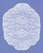
Take lace, for example. Where it may have once symbolized wealth and luxury due to the considerable time and resources required to make it, its production practices have become more accessible, and as a result, lace has become commonplace. Yet while its symbolic significance has varied over time, its status as a symbol of beauty has remained. Lace occupies an intriguing space in culture as it can represent both purity and sexuality simultaneously. From baptism ceremonies to lingerie, Queen Elizabeth to Kim Kardashian, lace is a common thread.
“Good Looking” also reflects on the historical conflation of femininity, softness, and youth with beauty and examines how these symbols continue to shape contemporary beauty standards. The colours and materials portrayed in many of the pieces - bows, rose appliques, velvet, ruffles - represent how society values and celebrates youth. The symbols, objects and patterns within the pieces have been intentionally removed or obscured from the body to be portrayed as standalone images. This approach gently reminds viewers that beauty is subjective and somewhat arbitrary. By deconstructing the aesthetic space and separating the body from its adornments, I hope to critique beauty culture with a sense of playful curiosity. In approaching them from a distance, I aim to showcase these traditional symbols as an avenue of self-expression rather than a routine expectation.
Most importantly, I hope that by challenging the notion that physical beauty is paramount and recontextualizing traditional beauty symbols, I may demonstrate that their power over us can always be subverted. Viewers are invited to reflect upon their own perceptions of beauty and move toward self acceptance.
Delaney Yvonne
Curatorial Statement
by Rowen Dinsmore
Delaney Yvonne’s solo exhibition, “Good Looking,” is an examination of our constantly evolving sense of beauty and the cultural obsessions we’ve developed as a result. Combining a light touch with considerable attention to detail, Delaney approaches her work with a sense of ironic contradiction. In a world where status and appearance dictate everything we consume, Delaney’s work seeks to satirise the superficial by making it transparent. By pairing used make-up wipes with hyper-realistic portrayals of delicate, intricate lace, Delaney cheekily sends up our wistful dedication to physical beauty with a reminder of its unromantic and torturous consequences.
While there is an ugliness to beauty, so too is there a beauty to ugliness; as such, Delaney’s work offers space to recognize the value of self-expression in identity-making throughout time. Consider the 18th century, when women wore light pastels, lace, and ribbons to signal both beauty and belonging. While one may marvel at the opulence and impact of 18th century style, it is also important to recognize the incredible discomfort that marked the trends of the era. From rib-crushing corsets to toxic make-up and comically large wigs, pain was just the price of admission when it came to signalling wealth and social connections through one’s appearance. Of course, it is not lost on Delaney how these flourishes have begun to reemerge alongside the resurgence of the hyper-feminine ‘coquettecore’ aesthetic.
As curator for this exhibition, I prepared by looking to 18th century fashion and design for inspiration. More specifically, I looked to Sofia Coppola’s iconic 2006 film, Marie Antoinette, a film drenched in opulence and excess. From Sofia’s signature visual style and ironic wit, to the anachronistic soundtrack and whimsical naivete of its titular character, Marie Antoinette offers a hyper-feminine feast for the ages, and perfect counterpart to Delaney’s work. In both, decadent symbolism is used to camouflage the painful sacrifices required to obtain it, demonstrating the absurdity of the beauty industry’s hold over all of us.
While working on this exhibition, I was often reminded of my own art practice and its intersections with aesthetic standards. I have always been interested in learning new perspectives, in deciphering how every person interprets life just a little bit differently. A few years ago I read John Berger’s 1972 collection of essays, Ways of Seeing, for the first time. Those essays, his third in particular, fundamentally shifted how I approach my work. My fixation on the gaze and vanity, on the surveyor and the surveyed, has become central to my practice much in the way it has for Delaney’s present work. Whereas my work encourages critical reflection on the act of looking through post-internet-inspired-self-portraiture, “Good Looking,” does the same without any representational work at all. Yet the turmoil of facing the world in a femme-presenting body is ever present, despite there being no bodies in sight, as evidenced by the fleeting moments and objects that make up only the mirage of a beautiful and important person.
In demonstrating the double-edged sword of beauty symbolism, Delaney dissects the cultural significance of these inanimate cultural ephemera by turning the focus back to the viewer and asking whether we should embrace their continued hold over us, or if it’s time to fixate on something more paramount.
Rowen Dinsmore
Exhibition Curator
Good Looking
a short film

Written and Directed by Josh Campillos
Starring Rowen Dinsmore
Director of Photography: Layla Bautista
Camera Assistant: Daylen Hartz
Key Light: Ryder Blanchard
Wardrobe: Hannah Pek
Special Thanks: Jordan Harvery, Benjamin Jorgensen, Sunny Liu
Produced by Bokeh Media
Location by The Avenue Room
Written for Remai Modern Art Gallery
In association with the 525 Art
Curated Playlist
by DJ Dev Daddy + Hannah Scheu
Audio Curators Statement
In Delaney Yvonne’s work, unpacking our individual and collective relationship to beauty is at the forefront. In her own words, her latest show Good Looking examines the absurdity and prevalence of beauty culture by exploring well-known imagery, patterns, colours and materials that have traditionally symbolized beauty. Her works gently ask us to question what we think we know about beauty; where we learned what we understand of it, and how its shifts throughout history have shaped not only our culture, but how we perceive ourselves and those around us.
In audio curators, Hannah Scheu and Dev Lieffers minds, Good Looking is the perfect opportunity to showcase how music can elevate the gallery experience and embody a collections themes. By combining physical art with sound, we provide an environment where a more thorough relationship to the art can be made. By engaging additional senses, we open the door to greater understanding of the art, the inspiration behind it, and the people who create it. Our work pairing collections with carefully curated music allows a more intimate connection between our guests and the pieces. Our inclusion of layered electronic drums, synths, and samples brought to us in tracks by The Marias, Syd, and pop industry leaders Magdalena Bay represent Delaney’s use of colour, texture, and intentional design. From romantic piano classics like our Gallery Hours playlist opener Love Me Like There’s No Tomorrow by Nat King Cole, through the hauntingly beautiful vocals in Spanish in Chinese by Zeauxi, to the more direct references to interpreted femininity such as Have You Ever Been to Electric Ladyland, a dreamy Jimi Hendrix cover by Nai Palm-the overarching themes of Good Looking are embedded both in sound and lyricism.
Our goal as audio curators is to expand our guests' interpretation of art; to bridge the gaps between the viewers, the works, and their themes. By pairing curated tracks with visual art, we further engage our guests' senses of nostalgia, self, and vulnerability- which open doors for the themes of our collections to penetrate deeper. Music connects the dots for some in ways some visual art may not alone, so having visual art and music work in parallel is paramount to enhancing the gallery experience. Beyond this, we use music to leverage emotions that help us better understand the impact art has in all of our lives.
Our playlists are curated with the same attention to detail as all other elements of our collaborations, in effort to turn our guests visit to our galleries beyond an hour in a gallery space, into a thoughtful, intentional experience. We’re proud to have sourced a diverse range of genres, languages, and tones to coincide with Delaney’s work. We welcome you to join us in good listening and hope you enjoy.
Hannah Scheu & Dev Lieffers, Audio Curators with The 525
photos by Josh Campillos


